Test Responsive
Sponsored Link:
Welcome to Test Responsive
Thank you for installing and using our extension

Features:
- Allows you to view website with multiple screen modes.
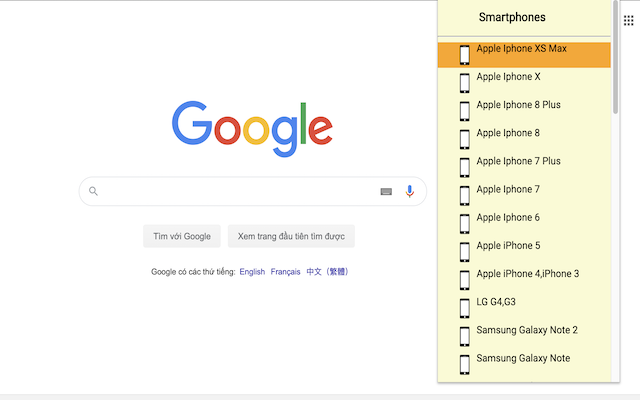
- Choose popular screens like iPhone, Samsung.
When you need to test your website or app on mobile devices, you have to think outside of the box. You can't use a mobile device simulator (like iOS Simulator in Xcode) because it doesn’t actually run on physical hardware. You also can’t rely on an emulator because it won’t behave exactly as a real device does. If you want to accurately test your mobile application, there’s only one place to go: dedicated Android test devices.
Please note as our chrome extension is just a mobile device simulator, the UI wont look exactly like how it would on a real hardware device. This is just a useful software to test how your website would look on different mobile specifications.
However, if you want to be 100% accurate, the only way to do so is to actually buy the actual Android phone model to ensure your website looks great in that specific mobile device dimensions.
There are several tools that can help you check how your website looks on different mobile devices. The most popular options include BrowserStack, Browserling and Cross Browser Testing. BrowserStack has a paid plan, while Browserling and Cross Browser Testing are free to use.
Tutorial:
- Install the Extension
-
After installing the extension, click on the icon
 on the toolbar.
Test responsive web designs or mobile pages that detect specific user agents. Test multiple devices at the same time!
The Mobile/Responsive Tester extension allows Developers to test their web pages against common mobile, phablet and tablet devices by emulating the user agent and screen resolution.
Sponsored Link: